Mastering Black and White Photography
Share
Mastering Black and White Photography: Tips to Make Your Edits Stand Out
Hey folks! Today, I want to dive into something close to my heart: black and white photography. It’s an art form that never goes out of style, but what makes your black and white photos stand out in a sea of others? Well, if you’ve checked out my Instagram and thought, “Wow, those black and white edits are pretty striking,” that’s no accident. Editing black and white photos is one of my favorite strengths, and I’ve got some tried-and-true tips that I’m excited to share with you.
In this blog, I'll cover the editing techniques I apply to every black and white image I work on. And as a bonus, I'm sharing my personal preset—a tool I’ve been using for the last two years. It’s free, so feel free to grab it in the description below.
To make things even easier, you can download my personal black and white preset here for free. It’s the same one I’ve been using for two years, so you know it works!
Download FREE Lightroom Black and White Preset, here!
Avoiding the Gray Trap
One of the most common mistakes I see in black and white photography is what I call the “gray, gray, and gray” problem. Too many people create images that look more like shades of gray rather than true black-and-white photos. The key to making your black and white photos pop is simple: Make sure your blacks are truly black and your whites are actually white. Today, I'll show you how to achieve those bold contrasts that turn a flat, gray image into something eye-catching.
Let’s Get Started: Editing in Lightroom
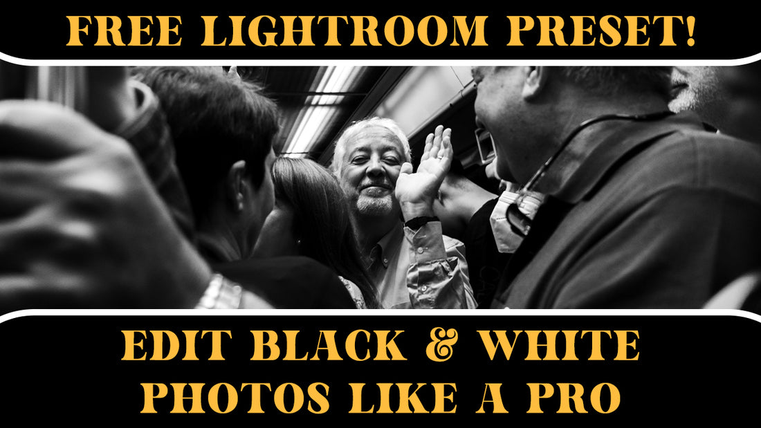
For this guide, I'll be using Lightroom, but you can follow along in whichever software you prefer. I'll walk you through how I edited a photo I took on the Paris Metro. The final edited image is available as a print on my website if you’d like to check it out (along with some cool photography merch for the holidays!).
1. Convert to Monochrome
Start by changing your color image to black and white. I use Adobe Monochrome, which has been part of my preset forever. Use a profile that gives you deep blacks—not one that crushes them. Trust me, we’ll get into why this matters shortly.
2. Exposure
I like to err on the darker side, setting my exposure at around -55 for this photo. The exposure will be specific to your image, but darker tones help establish mood and depth.
3. Contrast
Contrast is essential to creating dynamic black and white images. I usually crank it up to around 30 for that extra punch.
4. Highlights and Shadows
I tend to reduce highlights drastically, sometimes all the way down to -90, depending on the image. This lets me preserve detail while avoiding the overexposed, digital “glow” that I find unappealing. For shadows, I like to subtract around -30, which introduces contrast smoothly without going overboard.
5. Whites and Blacks
Whites help bring back some of the exposure lost from darkening the image. I push them up to around 60–70, but always be careful not to clip too much. I then deepen the blacks to around -20 to ensure there’s enough separation between dark and light areas in the image.
6. Check Your Background
I recommend toggling between black and white backgrounds while editing. It’s a great way to see if your blacks are really black and your whites are crisp, which helps avoid those muddy gray tones that can dull a photo.
7. Fine-Tuning with Curves
Even though you’re working with black and white, the tone curve is still valuable for fine adjustments. Be gentle, as your main contrast adjustments are already done.
Enhancing Skin Tones and Focus
When working with portraits or street photography, you don’t want your subjects to get lost in the high contrast. Here’s a pro tip: adjust the orange slider (skin tones usually sit in this range). By slightly increasing it, you’ll bring more focus to your subject’s face without affecting the whole image. A subtle touch here can make a world of difference.
Additional Tweaks: Sharpening and Clarity
I’m not a huge fan of the heavy-handed digital sharpening often seen in photos. Instead, I reduce clarity and texture a bit to give my images a more vintage, film-like feel. If you do decide to sharpen, be sure to use the masking tool in Lightroom to avoid sharpening unnecessary areas like the background. Hold “alt” while adjusting the mask to see exactly what areas are affected.
Radial Gradients for Subtle Focus
One of the final touches I add is a radial gradient to subtly draw attention to the subject. Bumping the exposure up just a tiny bit (0.10 or so) can make your subject pop without it being obvious that you've applied an effect. This is where subtlety is key.
Final Thoughts
Black and white photography is all about subtlety and contrast. The trick is to ensure your images have a full range of tones—from rich blacks to crisp whites—with enough detail to make them stand out. And don’t be afraid to experiment! You can always tweak things until it feels just right.
I hope this helps you create striking black and white photos that you’re proud of. Be sure to grab my free preset and let me know what you think! And if you have any tips or tricks of your own, feel free to drop them in the comments—I'm always looking for ways to improve. Until next time, happy editing!
You can also find my 'how to' and link to a FREE Film-Look Lightroom Preset, here!

